4.11.09

Curzon Cinemas Midnight Movies Flyer, poster, Labyrinth, Bad Santa

Hello back after a bit of absence with the new Curzon Midnight Moves flyers for Labyrinth and Bad Santa.

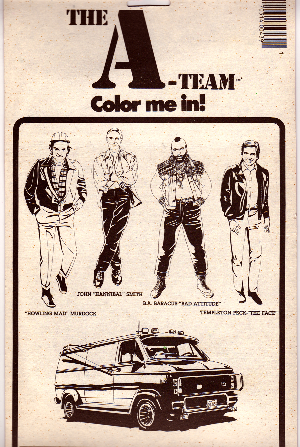
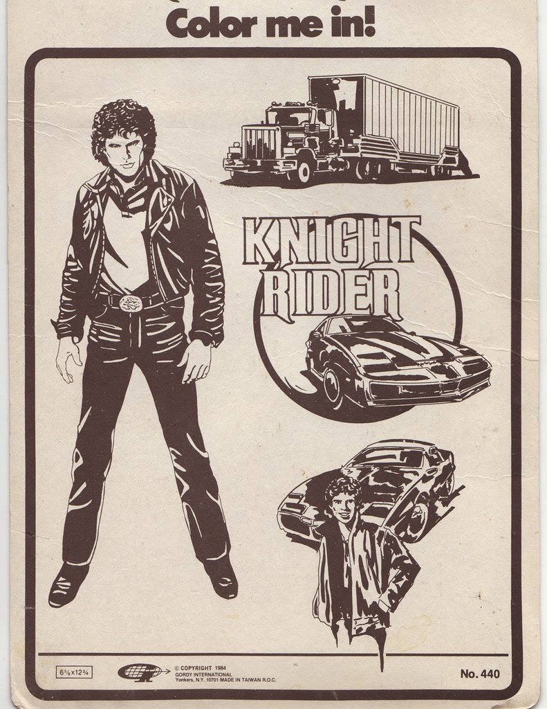
So ill start with Labyrinth. I wanted to recreate the feel of 80's recreated comic book illustration style like you would see in the pages of 'look in' magazine (if anyone else used to read it as a kid) or you got on various 80's merchandising (see here: 1, 2, 3). Due to there being a lack of technology and decent version of Photoshop at the time.

So after a bit of research i found they did do a Labyrinth comic book and so based the character illustration style around that and worked it around the Ball theme for the night.


For the Bad Santa i wanted to give it that quirky twist again. So i based the design around emphasising the BAD in the title and treated it like a 50's style pulp film poster. (for example: 1, 2, 3, 4)
I kept the illustration to a simple 3 colour print, offsetting them slightly. Then pulled out some quotes from the copy and had fun playing with the type.

23.4.09

Curzon Cinemas Midnight Movies Flyer, poster, grindhouse, Sam Raimi, Drag Me to Hell, An American Werewolf in London, John Landis

Here is the next Midnight Movies Flyer.
I did two alternate versions for the Drag Me to Hell as universal wanted to use the main image off there quad poster i originally used one of the movie stills for the old woman.
Rather than just dropping in the imagery I wanted to give it my own twist with a hand painted pulp, trash, old grind house poster style (harping back to Sam Raimi's 'Evil Dead' roots).
I took the original images tweaked and twisted them then painted over the top and this was the result.


For An American Werewolf in London i wanted to give it a more 80's style to reflect the film.
Originally i did it as a one colour photocopy mash-up style print, but more colour needed so i looked at it more as a sort of scrap book, old newspaper ad. Offsetting the colours adding the aged tape and adding the subtle use news paper text bleeding though the background.


Hope you like.

17.4.09

video cover, Video Nasty, grindhouse, film, vhs: The Rent Collector

Here is the cover of new video nasty sleeve cover the lost classic 'The Rent Collector' produced by 'Mondo Video' (a bit of a homage to Faces of death).

I wanted this to be a more 70's Roman Polanski esque, art house, skin flick, slasher film.

So lots of brown, earthy tones. Cigar smoke and leather pretty much sums up the feel i was after on this one.


1.4.09

video cover, Video Nasty, grindhouse, film, vhs: DUDE

Here is the beginning of a new design/art project based on early 80's video nasty covers.

It was something of an obsession of mine growing up, living in a small village i not much moved fast!, I even remember the first time i ever went to the video shop.
I saw the video store as a twisted pop art gallery, these brilliant covers all displayed in rows would entice me as I went around the aisles and viewed the display cases at the local 'Blaby video' or 'Hollywood video' shop.

Then as i got older i really fell in love with the video nasty section, it was like art porn almost. The excitement of what lay behind these worn, sun bleached trashy covers with there tacky Video logos and all the promises they made but sadly rarely delivered, 'selling the sizzle but not the steak'. really got my design rocks off.

Video nasty covers are what really got me into graphics, i started off by my own video covers for the old horror films i recorded off the TV and Its been a love hate relationship ever since. With this project I've come full circle and returned back too a subject matter that first inspired me, exploring design as pop art combining photography, illustration and graphics.

So here is the first in hopefully a long line of covers in the series.

27.3.09

pub identity and Menu, cricket, 1950's, Britain, green, print

Simple but sweet, an identity and menu designs for a south London pub called Cricketers on the green. I wanted to give it that old British 1950's reminiscent art deco meets war propaganda abstract quality.

17.3.09

Hovel gallery identity, art, woodcut, lino print, etching, three little pigs, wolf, castle, ruins

An unusual one, i have designed an identity for
HOVEL which is the working title of a living space Gallery an art intervention - a kind of crossroads for experimentattion - so the idea and the name plays with a lot of references ..the temporary living space which is squalid, dirty and poor - the cave of a hermit or a refuge - something unsantitary or unhygienic - a place where many poor people have to live - also a sense of old fairytales - the gingerbread house or the homes of the three little pigs.

The brief was for it to be an anti logo, the words drawn in a certain way to denotes some of the above qualities - something that should be ugly but isn't - at once ancient and contemporary ...a wolf trying to blow the word down and although it bends and looks like it may collapse it is resilient ..something make-shift - put together from different things but it can mutates and remake itself.

I hand drew the illustration and type then scanned it in and reworked the treatment in photoshop.

11.3.09

Console , computer game, 50's americana, cold war propaganda, Alien invasion, teaser insert, flyer, poster

Here are some teaser flyers concepts i produced for a new computer game.
Working around the concept of twisted 1950's America i came up with a few different routes.

1. was based around cold war properganda, with the message to fight back.


2. was based around the idea of postcards, going down a much darker horror route:


3. Took the same idea of the postcard route but made it more tongue in check, really playing around with the print effect too.


9.3.09

CBR, Citizens Band Radio, Music, country, outlaw country, 70's Rock, gig, Tour Poster

Here is the new design for the Citizens Band Radio tour Poster.

I have based the final style on the old American 'Hatch show prints'

I wanted to dig into the whole American cultural history to produce this poster in the same way CBR does with there music does. so the Hatch prints seemed to really shout out to me.
They say so much about the history of American music and the culture linked to it all..

5.3.09

Motley Crue, 80's, metal, rock, neon, Illustration

An illustration of the Crue i did a while back, i wanted to get that bright 80's vibe across with bold almost neon esque primary colours than i thought could you find a way of making the whole thing out of ink splats so this was the result.

3.3.09

CBR Citizens Band Radio, Band T-Shirt and Belt Buckle, logo, country and western, Rock, 70's,

Here is a T-shirt/logo designs i did for Citizens Band Radio (CBR for short).
There a brilliant classic 1970's country rock band from America.
So i wanted to reflect there music in the design with some classic Americana style, and what better way to say classic country rock than 70's trucking belt buckle!


The guys liked it so much after printing up the T's they then went and got actually belt buckles made produced.


Do check out the band they have some great tunes: www.myspace.com/citizensbandradio

Hey if you like it all bands merchandise can be brought here:
http://www.officialbandgear.com/Results.asp?CategoryID=44

Im now in the process of designing a tour poster for them.


2.3.09

Curzon Cinemas Midnight Movies Flyer, poster, grindhouse, zombie, night of the living dead, Squeeze box

So here is the flyer design i have just finished for the Curzons Midnight movies Night in Soho. I did a split flyer Promoting two very different nights.

Squeeze box is a documentary on the seven-year history of the punk/drag NYC party night:
So mixing up the themes of PUNK and Drag. I new i wanted a big central image that would tie it all together and i definitely wanted BIG hair.
The lipstick idea was the cherry on the tranny cake!


The other side of the flyer is a George A. Romero Night. Something that is quite close to my own heart (im a zombie nut from way back), so really got to undulge myself and give it that shlock horror 1970's feel, complete with badly aligned two colour printing technique. then a bit of weathering thrown in for good measure...

They're coming to get you Barbra!


... and then there was light

dud·ed, dud·ing, dudes:

Informal A man who is very fancy or sharp in dress and demeanor.

Slang To dress elaborately or flamboyantly: 'got all duded up for the show'.


So Hows it going dudes?

Welcome to my little show. Im a graphic artist using place to post my illustration, designs, photos and what have you online, So I thought i'd kick this thing off now and start putting some work up, things have been quite productive latley so its a good time to start.

This is all a work in progress at the moe so things like the banner head layout etc are all going to change over time.

Well anyway hope ya'll like my duds !