14.12.11

Modus Operandi DVD artwork


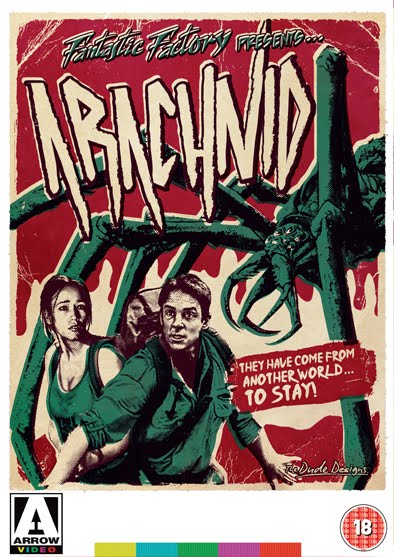
Here's the artwork for the DVD release of Frankie Latina's 2009 film Modus Operandi, which stars Danny Trejo, Mark Borchardt, Michael Sottile and Randy Russell. Frankie wrote, shot, and directed Modus over the course of four years, all shot on Super 8 film. It's a homage to B-Movies of the 60's and 70's. So i guess that's why they came to me!

So this was always going to be a fun cheesy design to play around with!

Colourful, packed with action, sex, gals, boobs and guns! Planes, helicopters... and even a phallic boat this time!


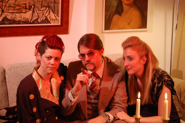
The guys wanted to promote Danny Trejo (being the most well known actor of course!) but while he's kind of a sub-character who's integral to the story, his appearance in the film isn't long enough to sell the film purely on the strength of. So i had to make him central to the montage but not the most prominent element, hence the other characters being larger!

Randy Russell (guy at the bottom) is the main protagonist and he's not your typical looking lead character, so i did pimp him out a bit more for added attitude with the shades and suit look. I also couldn't pass up the opportunity (with the film reel element of the storyline - watch the DVD, it will all make sense!) to play up a total and shameless homage to one of my own favourite film posters for the 1976 film Hollywood Man with William Smith!! Coincidentally I think Hollywood Man has just been released on DVD again in the US.

The other two main characters are Dallas Deacon (on the left) and the sexy Black Licorice... who i again pimped out in a low cut gold lame jump suit! Gotta love the jump suit!! I also threw in a bit of sexual innuendo with the aforementioned speed boat powering out from between roller girl's legs!


Colour-wise i went for a strong 70s yellow, brown and orange pallette, taking lead from the very cool interior decor styling seen throughout the movie (a set Frankie the director actually built himself... the man can decorate my flat any day!!!). I wanted to capture the same classic retro decor tone with the style of the packaging design. The use of the old Super 8 logo sticker was actually from the director who i got chatting with while working on the cover and i think it really builds on that whole vintage packaging vibe!

16.11.11

German Super movie DVD Blu-ray cover


This is the German DVD Blu-ray artwork i created for Kotch Medias release of James Gunn's Super movie. they sound like a company who know what they like and it wasn't the truly terrible UK artwork. Time was tight on this one and i was working on another job when this came in so i worked up a rough photo concept which now seems to seep out on-line but this is the actual artwork!

The original artwork had a strong creative and took a more high concept route. which i guess didn't really work more for the DVD market the UK released THIS! (shudder). So i got contacted by Kotch Media to produce a design which would be more cast orientated! as there really is a plethora of talent going on in this one (Rainn Wilson, Ellen Page, Liv Tyler, Kevin Bacon and the great Michael Rooker!!) so i wanted to get everyone in the action but still give the artwork some style which related back to the films storyline. I explored two routes for this design one being the classic 70's esque over the top explosion and big title treatment, then this one which Took the super hero theme which treated the whole DVD cover 
a classic comic book design, the composition still has that narrative poster style but building it around the comic book concept allows the visual to capture the vibe of the films story line and then relate it back to the viewer, it also gives the cover a different twist and a more fun look to stand out on the shelves against the other movies.


I saturated the use of colour more in the illustration to give the thing that comic illustration vibe without being too 'cartoony' and polished it off with that old dot printing effect and offsetting the colour plates slightly so the whole piece has that distorted out of registration look (you can see a more detail section above). Again i was very happy that Kotch media ran with this as well and didn't just request a more clean version of the artwork to be used.

7.11.11

BloodSpayer feature

An interview i recently did for bloodsprayer, this one has tongue firmly in cheek as Rondal the writer wanted to interview the man behind the man... ?!?!
So i squeezed into my ever shrinking 70's western suit cracked out the Cubans poured a dram of whiskey and sat down to talk as 'the dude' exploitation poster designer extraordinaire and all round social degenerate!! HERE

4.11.11

Fathers Day Poster wins BEST POSTER award at the TORONTO AFTER DARK FILM FESTIVAL

You can see the 2011 award winners here, Fathers Day also won the audience awards for best film!!!
Dont forget to check out the making of at 'An evening with The Dude Designs' short on you tube so you can see what REALLY goes into designing a classic exploration poster! (and yes i will keep plugging it the damn thing cost me over £300 to produce it!!!)

2.11.11

Download and make your very own FREE Hobo Video artwork


I promised if the Dude Designs FB group counter got to 500 i would post up the Hobo video cover artwork i created for the evening with the dude designs video to allow people to download it at home and print off to make your very own FREE! Dude Designs Hobo video cover like this.


To say thanks for all the on going support with these posters and to give a little something back!
It's not easy but seeing people enjoying this stuff and hopefully bring some magic back into the world of poster designs makes it all worth it!

So enjoy !!!

Madison County movie Poster


Heres the new poster for Madison County folks!

Its been hectic over he past few months going full time on the poster work so i haven't had time for write ups unfortunately. in time ill go back and fill in the blanks, however here's the latest, i actually completed this design right after The Legend of the Psychotic forest ranger LOTPFR, (so if you want to know what i did last summer, all two weeks of it in the UK! this is it!!) having already jumped on the more tongue and cheek side of the slasher, i had to change gears for this one and deliver a more straight laced piece. Also i couldn't use an AXE! i was geared up for a chainsaw but was informed there is NO chainsaw used, so i dragged old Betty back to the WORK SHED! and sat down to create a more serious slasher design!

The film itself is by first time director Eric England and the lovely producer Ace Marrero (who very kindly brought me a MASSIVE -over 6ft- poster of the Italian death wish 3 as a thanks!!). Its very much in the same classic vain as films like A Texas Chainsaw and The Hills Have Eyes, so i really wanted to draw that vibe out for people in the art to allow people to make the connection and as always set them in the right mind set when siting down to view the film. 90% of the action takes place in the day this time so we wanted the design to reflect that sunlight rather than the black darkness which you usually get in horror posters, rather than dropping in a blue sky though i wanted to give the piece more atmosphere so thats where the orange sky came in, the same way the puple sky works for night!! it just holds more visual impact i felt.

The guys already had some photo posters out with a still of the pigs head being cradled by Damien, so they wanted a more classic montage style design, to deliver the narrative of the film and give it more emotional impact (i do apologies for women get such a bum deal on this one but a girl screaming holds a lot of cultural baggage through the history of horror film posters generally women tend to do the screaming, i suppose we could get into the psychology with the majority of the audience being male, what emotions this will drive in the viewer, i like to think its one of protection and damsels in distress, your probably going to want to run in and protect a woman being attacked by some pig head wearing psycho than the guy at the gas pump! (they where always the throw away kills at the start weren't they! gas pump attendants DO NOT have a great life span in slasher films... think about it!).

I digress... so i wanted to get some kills n thrills around the poster in a forest setting but for the main centerpiece i really needed to have a classic slasher pose of the BIG money shot scream and knife wielding maniac, so a total nod to posters like Beyond (awesome poster!), the devil within her, hell hole and Mansion of the doomed, among many others where all influences! but how to get both killer and victim playing to the audience in an embrace of death with full frontal screams and a totally over sized knife coming out towards the audience! became the challenge. So i had to do the old Drew Struzan trick and once again convince my girlfriend to pose for some reference shots (thanks babe you have to suffer for my art as i tell her!!) then add a WHOLE lot of forced perspective! in the final composition i had Damien doing a sleeper hold from behind glad to see those years of watching wrestling didn't go to waste... what do you mean its not real dad!!) i also had to fulfill my hand obsession by having the unfortunate girl grabbing outwards, i love posters which literally reach out to the audience it adds a feel of depth to draw the viewer in and hopefully pull a few emotional strings with a plea of HELP ME! to the audience. Please do note the grime on the girls body as that became a real pain to do but when i had her clean it just didn't have the same atmosphere!

Finally the title which was also total Biiiiiatch! to illustrate if it was just text the job would have finished but painting the sign with the rust! (don't attempt to paint rust at home kids its very monotonous!).

Over all the feedback was great especially a great comment from the producer "looking at it felt as if I was watching a video" which was brilliant as that was the exact tone i wanted to go for this time!

Well hope you like it dudes... All the best Tom!

28.10.11

Death Waltz Recording Co.


A bit of a change from the poster designs but very much in the same vain, here is a 80's VHS inspired logo identity i designed for the soon to be launched Death Waltz Recording Co. Who will be releasing limited edition cult vinyl soundtracks check them out here. So they wanted a fitting logo with that old school Video distribution company vibe, i played around with a few routes and as usual the best one was the last, this spells it out really the heartbeat of the last death waltz, with a stylized TV screen distortion in the background. (thats gradated the blue lines!)

Red Scorpion DVD Cover


10.10.11

Howlin for you poster @ I Want My Music Video Art Show


I did a comision for the director Chris Marrs Pilliero to go with his recently MTV nominated music video for the Black Keys: Howlin' for you, its also on show at the Meltdown gallery in LA as part of the I want my music video art show.

23.9.11

VIRUS magazine interview


Well i was very excited to get a 4 page feature in the new issue of Virus Germany's leading horror magazine!

17.8.11

Dear God No!

Dear god NO! Bikers, beards, boobs and big foot... what's not to like!!!!

I was first attracted to this project after the director James Bickeret contacted and told me how it was 'Shot entirely on SUPER 16MM Fuji film and using equipment from the era' which got the juices flowing as its a similar work ethic i have with the design work.

Then secondly the bikers! Im a MASSIVE biker film fan and you just don't get that many 70's esque bikers films floating around these days so it was a match made in heaven! and i instantly wanted throw my hand into the annals biker film history by creating one of the coolest, meanest, mutha F*$KING looking biker film posters you have seen!! Something that you could see sitting on the walls of a Harley Garage but keeping tones of horror (left house on the left) meets monster (grizzly) film vibe.

James was cool to work with and pretty much let me do my thing all he suggested was he wanted to see boobs (not to worry about covering them up) and flames would be cool too!!

THAT I CAN WORK WITH...

I didn't get to see the film before working on the poster as it was still being edited but the trailers got a lot in it so i was able to gather all i needed to know from that and i was also supplied the original soundtrack which the guys have put together so listening to that helped set the tone as well.

I started out with the title design as per usual and i toyed around with having the logo first in an iron cross format, but it left me with an awkward shape to fill the poster with and the name just wasn't jumping out enough. Dear God No! Is a real expressive phrase so i wanted to reflect that screaming tone in the design, im not a big fan of straight typed out logo fonts as i feel they look mechanical and rigid, hand drawn type like they use to do hand more of a natural flow it, even if you take a font and warp it in photoshop the edges just seem so harsh you can tell its distorted photoshop text so i usually mess around with fonts then take it into photoshop and redraw the whole thing by hand to get that classic vibe and warmth to it.

When it came to the layout i wanted to have Jett Bryant who plays the main big bad biker dude prominent as a main character... he's got this real iconic vibe going on with the beard, denim and hair (not to mention the Aviators), but i didn't want him to come across as a 'hero' so i gave him the ol' double barrel to have more of a sinister killer edge (plus it looks sweet), actually every one seems to be bad in this film so there's allot of frowning going on!!. Another big part of Jett's image is that beast of a bike, so pumped up the scale a bit and gave it the main focal point as it drives out of the poster.

Madeline Brumby is the other main character in the film, she plays the young innocent but not so innocent girl! So i gave her a dark edge (with a mean frown) and wrapped her round the base of the bike which i felt was quite reminiscent of that classic 70's fantasy art vibe.

Once the main section of the poster was nailed down i then needed to work in the other topless girls (i loved iconic image of the Nixon masked stripper especially!!) and more of the bikers so you got the feel of them as a 'gang' rather than just one loan biker. I also needed to have them more knocked back from the action, so as not to crowd the main focus of Jett and Madeline consequently having the whole thing looking like a visual mess. I know a lot of people want to use all the space in these montage style designs but it really isn't about that, you have to be careful to balance out the elements and not be afraid of the space, its not an all you can eat buffet its a poster!!

Then it became a bit of a challenge as to how to represent the 'horror'!! I'd done the bikers (check), boobs (check) but big foot needed to be in there somewhere. Finally i came up with the idea of using him as part of the background image more and colouring him red, this knocked him back even further back and gave the composition three focal plains, (biker and girl foreground, gang and stripers mid ground, road and bigfoot background). The strong red colour also allowed me to do something different with the flames that James wanted and blend them in with big foot more.

You can check out the trailer HERE.

I also want to give a big that to Dave Harley and everyone at Bloody Disgusting for posting up the exclusive! tireless work guys, always appreciated!!

8.8.11

Bloody Disgusting pod cast


The guys and gals at Bloody Disgusting kindly asked your friendly neighbour hood Dude Designs to sit in on the latest pod cast, to chat about design and general horror film stuff!

Well the resulting show has now been posted up so check it out and hopefully enjoy! (it was late when i did the show due to the US UK time difference so not sure i was firing on all cylinders, a couple of whiskeys and a cigar did help me through though!!)

3.8.11

The Live Movie Event Empire Big Screen at the 02 Arena


Great news!!

I'm going to speaking alongside a panel of Experts (including Graham Humpherys and Olly Moss) at Empire magazines 02 Arena film expo 'Big Screen' On Friday August the 12th @ 12:45pm

We will be discussing the Greatest Ever Movie Posters, what makes a poster iconic, the trends, fashions and famous artists in movie art and the processes that goes into creating vivid unforgettable images.

So if you going down be sure to pop along there's going to be around 15k attending but if you do see me around say Hi, im a very friendly guy!!

EMPIRE MAGAZINES BIG SCREEN EVENT

29.7.11

An evening with The Dude Designs

Well its finally here folks !

I was kindly asked to say a few words about the Fathers Day poster i designed for Troma and Astron 6 so please join me in the design boudoir and lets discuss the finer points of what goes into designing an exploitation poster

Directed by Andrew Gaston of Secret Films, you can see his other stuff here 1 2 3

You can view it in all its HD glory HERE!

26.7.11

Imagine FX magazine Feature!

Very excited as its my first time in print for one of these interview articles... So go out and purchase a copy of imagine FX if you get the chance.

23.7.11

BBC NEWS Film poster artists revive a dying craft


A great scoop for the old Dude Designs here a feature on the BBC news no less!!! where they talk about the lost art of film posters speaking with myself and the great Graham Humphreys!

You can read the article HERE.

13.7.11

Hobo With a Shotgun Competition

How would you like to be cast as The Hobo and have your very own portrait illustrated on the Hobo with a shotgun poster... Well now you can!
Cult labs are celebrating the Blu-Ray and DVD (sadly not VHS or Beta Max!) release by holding a competition to win a one off custom edition of the Hobo poster!

Details are here and the film site is here

3.7.11

The Legend Of The Psychotic Forest Ranger


Well folks heres the poster for The Legend Of The Psychotic Forest Ranger one of two slasher films I’ve recently worked on. This was a small independent affair which I agreed to help the guys out on way back around the Hobo time, its just took a while to come around.

It was also a great opertunity sink my teeth into a horror genre poster, I’m a big horror fan and haven’t worked on any horror posters yet, plus it was a rare opertunity to do a cheesy, 80’s ‘in the woods’ slasher homage. So I could really ‘camp’ up the action (get it!!) In the design and go totally OTT.

There had to be a bit of a different approach to working on this design as there just weren’t any usable assets to work with for the illustrations, I didn’t even have a cut of the film. So we arranged a photo shoot with the guy who played the titles homicidal Maniac (and is actually a university professor!! ) and the Photographer Corey Kats (his site is here) who also worked on the film. I sketched out some comps showing poses and angles id like to see for reference then the guys went to work! Corey did some awesome pics which I could have created about fifty different designs from.

Although we had some great imagery to work with I still had to change allot of the elements around to get it all balancing (and fitting into) the composition. ALLOT of forced perspective was involved, which is the great thing about using illustration in movie posters, you can really accentuate the action more that straight photography can offer, having action bursting out and gives some real depth to the piece. So it something I like to play about with this as much as possible!

For the final design I kept with the concept which I had in my head from the start that would be a break from the trademark montage style and create all the action centered around the viewer, to really draw you in and give you the experience of what it would be liked to be in an classic cheesy 80’s horror film, running away from the manic killer through the dark misty woods, tripping and falling over... then looking back... and there he is behind you!!! Axe in had just about to hack you to death!

I also wanted to see if a could get the biggest god damn axe squeezed into it one as possible! (I don’t know if there’s a world record for the biggest axe on a film poster but I’m hoping to be a contender). I also through all the classic elements you would expect to in an 80s slasher moon, rolling mist, dark trees with lots of homages to everything from Sleep away camp to Silent Madness and Frightmare mixed in the design.

The Director Brad mills wanted to have glowing red eyes behind the Rangers glasses so I twisted this and gave him a red refection of a screaming girl, its more of an abstract image than a true reflection, which represents part of the films storyline (not to give too much away!).

For the title design I went for a complete Friday the 13th tongue and cheek nod. Had to be done! and good for getting people in the right mind set for the style of film.

Well hope it doesn’t give you any nightmares folks and catch you next time round with another slasher soon!!!!

30.6.11

Guttersnipe interview


Hey im sure your thinking 'Not another one' (i am designing like a mad man in-between 3 posters to come shortly!) but they really do help to get the word out about poster design and communicate to a different audience every time... also of course i always make some valid points as well !!! so check it out HERE

Also has a lovely intro:

" Actors, directors, screenwriters, special effects guys, and composers. The media is fascinated with the cult of personality that make up the front lines of the film industry, and everyone seems to care about what these particular people have to say. But you know who never gets interviewed? You know who never gets to sit in the media spotlight?

A person who is just as talented and as devoted to his craft as any of the aforementioned individuals: the dude who toils away creating the movie poster.

One such dude is a dude who literally signs his work “dude”. I know him better as Tom Hodge, the outrageously talented British wunderkind who has come out of nowhere to take the cult film poster world by storm. I recently had the chance to chat via email with Tom about what it is he does, and the state of the movie poster."


28.6.11

Vice Magazine Interview


Well the ladies and gentlemen at Vice kindly asked me to say a few words about designing exploitation posters among other things and they rather optimistically titled it...
Getting rich drawing guns and tits

17.6.11

Hobo With a Shotgun Poster Competition

To celebrate the UK Launch of Hobo with a Shotgun the Famous Prince Charles Cinema in London is having a grindhouse double bill showing Hobo and Both Grindhouse films! and also holding a Poster/trailer competition to design your own Hobo Poster judge by me no less so have a bash all the details are HERE and HERE and Here are the entries so far!!

8.6.11

the guys at igorslab popped me a few questions about design, films and what, and the resulting interview is now on there site... www.Igorslab.com

31.5.11

An evening with... 'The Dude Designs' Shoot part 1

Here are some phots from the first half of An evening with The Dude Designs short, filmed by Andrew Gaston about the Fathers Day poster... talking about design straight to Camera can be a bit dry so we decided to spice it up a bit and turn the whole thing into a quirky little themed 70's style programme, keeping in with that DD vibe and hopefully make a few people laugh.

In the words of Burt Reynolds 'Portraying a self-mocking hustler'.

If you want to see more the rest are up on the obligatory Facebook page

23.5.11

Interview with Couchcutter

Here's an interview from the Couch Cutter with DD about poster design and general exploitation movie chat... COUCHCUTTER.COM

4.5.11

Tromas Fathers Day Poster


Lock up your fathers it's... Fathers Day

I got approached by the ladies and gentlemen at Troma and Astron 6 and to do what the dude does best and come up with some classic exploitation art for there new film Fathers day, So this ones all flames, boobs, chainsaw, guns and of course a car chase...

The subject of the film is a rather sensitive one... dad rape 'all fathers all raped... can you see a pattern' to quote!!

Now I didn't want to display man on dad action in graphic detail for fear of turning people off (and its also not the main style angle we where going for, The film itself has some awesome home video touches like its almost recorded straight off the TV with intro ads and even a trailer break so we wanted to communicate that trip with the classic 70's, 80's style... which is why i guess they came to me!!). They had some really strong characters going on and i do love my classic character driven posters So i really concentrated on them for the layout.

The title design was supplied for this one and the design is quite a square block so i had to center things around it in the layout as its not a format which i could just run along the bottom of the poster. I then worked the main characters in a sort of pyramid form (with them almost coming out of the title and looming away into the distance... a bit of a homage to the man who loved cat dancing poster there!) surround by the flames which work great as a vehicle to frame the characters and they also do have a meaning... but you need to watch the film to find out what!!

With that as the focal point i worked all the other elements around it to give the poster its narrative. I brought in the dad rapist as the largest character in as hes the evil character and wanted him to have that mysterious haunting quality in the background looming over the proceedings. This is the offset on the right hand corner with the classic girl being assaulted scene... which seems to be becoming a regular occurrence in these posters! (see Savage Streets and Hobo).

The inclusion of the priest and 80's man whore where also vital as they are two integral characters to the plot so i couldn't leave them off!!! plus the priest does add an unusual angle to the narrative i felt.

Lets not forget that classic car chase car chase which had to be added for two reason 1. it is the amendment to the helicopter rule, (one or the other has to appear in there some where!!!) and 2. i think the guys at Astron 6 where rather proud of there death defying stunt work on this one so wanted it included in there somewhere.

Finally to get that specific balance of the sex and the violence i used the strippers to frame the bottom of the poster (note the creative nipple coverage!!) and tada... you have yourself a classic exploitation poster!

The whole thing went rather smoothly, so thanks to the guys and girls at Troma / Astron 6 for that!

28.3.11

Interview Part 1

Hi,

Thought i'd share this, i got interview request by Marcus Goodman about getting started, poster design in general on his site Hamster Triathlon so i thought it was cool you can read me rambling on: PART. 1 HERE

25.3.11

Savage Streets Linda Blair


Savage streets was a cool one to work on as i got to give it that real 80's video cover style mixed with the classic action poster montage structure and inject a little something different to the other versions that have been done, the composition was the main challenge with this one as there had already been about 6 totally different posters, video covers and DVD covers already designed for it in the past, and they where all great (even if someone felt Adrienne Barbeau was hotter looking that Linda Blair on the classic uk Medusa release).

Watching the film there was one (or two) BIG things that jumped out at me! I have never seen such an indulgent use of breast in a film since an episode of Benny Hill! from Linda Blair bouncing down the street in the intro, to the gym class work out, to the shower fight scene.... i could go on! (im never going to be able to watch the exorcist the same again!!!). So wanted it to have an 80's action film meets tacky 80's porn vibe. Which i reflected in the colour scheme, Linda 'glamour' baby doll pout porn hair pose... I admit it may be a bit heavy on the sex but i felt that this was a big part of the film and an avenue for the design which hadn't really been explored so blatantly before in the other poster/cover treatments, so it was a different approach which would allow me to bring something alternative to cover.

I also really enjoyed playing about with the type giving it a new title treatment and getting that quintessential VHS style to it... ahh a rough script with a flat colour drop shadow... nothing says video box art better!!!

Well hope you like this take on a classic video title.

Pervert!


PERVERT! Well this was a bit of an oddity Its one crazy ass movie, created as a homage to Russ Meyer movies of the 60s.

Which really needed to be drawn out in the tone of the cover as the danger was people could get turned off by thinking its was just some crappy soft core porno film which are A) awful and B) a dime a dozen.

So this design is a total love letter (or soiled sock!... bad joke!) to the sexploitation film posters of the 60's and 70's.

unlike allot of the action / horror style posters theses usually had a more minimal layouts focusing on the one girl with the big curves to pull in the punters to the seedy cinema joints, i did have to tone the curves down a bit though after the first draft so i hope ive still managed to maintain the impression of Mary Cary having some shape in this film and not just looking stick thin).
where these posters really went for it though was with the use of type, something which doesn't get used much in the Arrow illustrations so i think ive made up for it with Pervert!!
Russ Meyer's was a total show man (i read some where that he used to make the posters first then if they where well received then he would make the film) and there was a definite carnival approach to selling these films, with outlandish statements made on them, so i took a couple of quotes form the us poster and DVD, but i have to admit im responsible for the cumming to get you and Busting out in... all bad puns i know!

I found allot of inspiration from posters like 'A trip with teacher' and 'Stepmother' where i loved the juxtaposing of illustration styles the main character is quite polished and then having rough sketchy line drawings for the background characters, its something i hadn't done before and i think works really well.

For the film title it was a bit of a twist on the classic cookie font which just says 70s and sexy so well, the phallic exclamation mark is actually not just a childish joke but like the innkeepers title has a bit more meaning behind it and the strange storyline...

10.3.11

Ti West, The Innkeepers poster 2


Here is the second poster for Ti West's The Innkeepers and this is as about as minimal as i get! Its designed more as teaser poster unless ive grinded away for days on these poster illustration i think something is wrong!! So this one was done as an extra because Ti and Larry Fessden liked the concept so much.

Its very much designed as a homage to the serious Mystery/Thriller posters of the 70's. Again still incorporating that Victorian vibe, which relates back to the hotels mysterious past...

Along the winding path of research i did into all things Victorian i came across designs for these ornate key hole protectors, they where Incredibly elaborate (as where most Victorian things) with these flowing and curling fluer (stylised decorative ornaments that resemble the fleur-de-lis = lily flower) details which i thought had this real sinister edge. So reworked the and designs slightly overemphasising them (as i wanted to keep it subtle) so they almost felt like clawing hands which would drawing you in to the darkness of the key hole if you stared at it too long and wouldn't want to see what lies in the cold empty darkness behind... MUWAHHHHH HAA HHHHHHHHAAA!

I do have to admit it was Ti Wests idea to have an empty key hole i originally had the idea of the ghost peaking through, so i guess less is more and this way it lets the imagination fill in the blanks!

The great thing about the Innkeepers posters is that creatively i was able to reference the rich history of Victorian design for my inspiration, allowing them to have some creative substance rather than just 'a grind house poster' particularly with this title where that wouldn't have suited the plot line and totally given off the wrong impression.

6.3.11

Ti West, The Innkeepers poster


This is another big break for the dude designs!

Its the new poster for ‘The Innkeepers’ film by Ti West (House of the devil) starting Sara Paxton, Pat Healy and Kelly McGills.

It came about when like Hobo I sent an email to Larry Fessenden at Glass eye pix / Scare Flix. Saying how I’ve been a fan of their films for ages (they have a brilliant
Catalogue of original off the wall horror/thriller titles) and I just did the Hobo poster
So if they needed any posters designing for up coming films… I’m your man!

Then the next thing I know I get an email from Larry wanting me to work on a poster for none other than Ti West!!! I was stoked to say the least; I’ve also been a big fan of his films the Roost, Trigger man and House of the Devil of course!

I actually got to work quite closely with Ti West on this project as the film was still in production I never actually got to see a frame! So instead Ti sent over a selection of film posters and a write up which set the tones he wanted to present in the final poster.
I like most people was expecting to do another full on horror film but Ti kept saying
That The Innkeepers isn’t a straight horror film, it could be a G/PG rated and to think more Fightners, Victorian ghost story, Charles dickens Christmas Carol and even ghost busters!!!

I sent over 10 different concepts for this one (quite a lot for me!) and this one was one of the last I did, it was also the one that had that eureka moment! There was a bit of wrangling over the choice of the final route but I managed to convince everyone that this had the IT factor. It really ticked all the boxes! and had that strong design concept to back it up and visually tie all the elements together.

I did allot of research into Victorian design styles and got drawn towards the Art Nouveau movement in the end because of all the wavy ethereal lines and curves which set the tone so well.

I then also researched into old ghost story books covers to get a more light hearted spooky vibe and found The Fontana Great Ghost Story anthology a massive inspiration. (If you can get hold of them they do they have some amazing illustrations!).

Then finally I have to take my hat off to Drew Struzan as a big inspiration, especially when you want to set that 80’s Goonies/Adventures in baby sitting montage poster vibe.

So for the final design I blended the ethereal lines of the Art Nouveau border with ghostly mist and set the composition on three plains, the mist in the foreground, the two intrepid ghost hunters walking through the spooky mist with there torch in the middle and the ghost (which wraps around and frames the whole scene) coming out in the background (for that classic ‘its behind you’ setting)

The humour element is depicted through main characters pose as Sara is the lead character it allowed me to play with the stereo types and place the guy hiding behind the girl I was also able to emphasise there spooked expressions with the torch light.

The green/blue colouring was inspired by old oxidised copper to give it that antique ghostly feel and finally the title design was inspired by the engraved type on old bar/pub signs and mirrors, I did over emphasise the spirals and curves to be more suggestive of spooky goings on and tie in with the art nouveau style for the rest of the poster. Also note the subtle pigeon and deer head!.. Which all link back to the film and are put in a suggestive teasers, all will become clear when you watch The Innkeepers!!!

24.2.11

Obsession De Palma


Also this week the artwork for Obsession got released so im posting that up as well! this was done way before the Fantastic Factory and Hobo but took a while to get published.

Obsession by Brian De Palma its a Classic you have never seen, originally penned as a Homage to Hitchcock's Vertigo, the guys at arrow requested something fitting that had a Saul Bass Flavour, now this was done before the FF collection so up to now all arrow stuff was painted and i did a couple of concepts which combined that pained style with a Saul Bass touch but this one was more out there style wise so wasn't sure they would go with it but they did!

I wanted it to have that Saul Bass Vibe so people would get that visual recognition of the Hitchcock connection but i needed to put my own stamp on it and i didn't want to just do a total pastiche of a Saul bass poster. Also i felt due to the nature of the film being a bit of an 'unkown classic' it needed more of a visual narrative to draw you in. (that's part of the problem with the whole minimal poster trend, it does tend to rely on you knowing something about the film/story line for you to get 'it' and have that visual recognition or your left thinking WTF!? a bit). So instead i looked more towards Saul Bass's technique of woodcut printing to get the vibe across, researching into woodcut illustration i found the work of Mark Rowden Really lnspiring.
So that was the technique sorted then for the layout!

The basic story of the film is 'its a man haunted by guilt following the death of his wife', so to get this across to the viewer I divided the poster up in two halves the bright past and the dark present circa 1979. So you have Cliff Robertson expression of pure desperation set in this black square looking down on him and his wife (Geneviève Bujold) dancing from the opening scene surrounded by this bright yellow, this is then all tied together with the classic spiral to represent the Hitchcock connection!

See its not just a case of slapping things about on a page to make it look nice. You really do need allot of thought and consideration behind a piece or people will see through it, that's why it always comes back to research! You need a good grounding for a design/ illustration to give it that substance and allow you to explain what you have done and why, it also helps you sell in the designs to the client.

Brian Yuzna, Fantastic Factory Collection: Arcahnid, Faust Beyond Re-Animator and Romansanta


Here is the Fantastic Factory Collection,

I got given a collection of four dvds from arrow: Arachnid, Faust the love of the damned, Beyond Reanimator and Romansantana the waerewolf hunt and a short brief to 'unify the titles' and the connection was that they’re all Brian Yuzna (Director of Re Animator and Return of the living Dead 3) productions. I did a bit of research and found they fell under his production company set up in the 90s called the Fantastic Factory so hence the Fantastic Factory presents... (it was going to be the Brian Yazuna Collection at one point but it was considered a bit confusing as he directed some produced others and was a creative producer on one so not the strongest link).

So For these cover i looked at ways of making the series totally different from everything else that i have done for arrow so far. Give them a strong identity which would be able to link four VERY different titles together and would still be an adaptable style to suit each title, Most importantly though i needed to make them visually very collectable especially with the posters inside.

I did my visual research (one of THE most important parts to design!) and looked towards doing them in a limited edition screen print style. An alternative pop bubble gum twist on the classic B movie poster. Particularly with such titles like ARACHNID and FAUST they sounded like modern drive in movie titles.

So i my main aim became to create something fun and vibrant which would stand out from other dvd styles on the shelves.


17.1.11

Hobo With a Shotgun Poster


Well Its the big one and it's been all over the web now on!!:

IGNEntertainment weeklyIMPWorst PreviewBloody DisgustingBeyond HollywoodTwitchShock till you dropScreen JunkiesGreek TyrantHorror SocietyShock till you dropFangoriaChudMubi

I'm proud to present the new poster for Jason Eisener's Hobo with a Shotgun, which I've been excited about since I saw the trailer in the Tarantino/Rodriguez Grindhouse film(s). Now it's a full-length feature and staring The Hauer no less - it's a proper hark back to the vigilante films of the 70's/80's and the whole future gang/ punk films of the 80's.

So it was an opportunity not to miss!!! I posted a message on the Hobo site saying "I do posters etc, love to knock something together for you guys..." and the next thing i know Jason Eisener emails me back saying:

"I'm extremely impressed by your work. We seem to share the same artistic inspirations... Would love to see what you could do with Hobo With a Shotgun.... P.s Your Jaguar Lives is inspiring. Also did you make that vigilante video logo? Its amazing. "

Well I was stoked to say the least and worked my ass off to turn something around quickly before they forgot i ever emailed them!

There was no holding back on this baby - I went for the full balls out 70s/80s exploitation vibe, throwing everything into the pot and looking back over every exploitation poster I did for inspiration!

My main thought process/direction for the poster was to give it a strong narrative. I mean, that's what was so great and captivating about the old posters, they really drew you in visually, telling you what the film was about. It was easy with this film - all i had to do was say "Look at this cool thing here... and also over here... and check out Hauer, he's in it and he has a MASSIVE shotgun and he looks PISSED!!!"

I did take liberties with the shotgun, making it look more over-the-top/futuristic, which is all part of the style! It's just the done thing - check out the covers of Savage streets and the executioner part 2. Another must is that you always need a helicopter. Whether there is one in the film or not there's a definite correlation between the decline in the number of painted helicopters and the quality of movie posters these days! A helicopter tells you it's exciting, and there's a budget!!!
(Well, a helicopter in a poster used to tell you that but I'm getting old these days. Maybe kids today just aren't impressed by such a thing. When I was growing up we based an entire tv series JUST on a helicopter!!!)

As far as the colouring goes, everything I saw already for Hobo had a strong yellow and black colouring but I didn't want people to think of Kill Bill, as a friend pointed out, so I needed to bring in some colouring which would give the poster its own feel. So after looking at the trailer again and again and again...I wanted to reflect that vibrant, neon, almost-80's style, so i brought in a strong use of magenta/purple in the sky and on the lighting for Hauer.

The massive Hauer title at the top is, again, harking back to the glory days of the old Charles Bronson films, where the lead actor's name was usually bigger than the film title. I've got a great video of The Evil That Men Do on which most of the cover is taken up with 'BRONSON' printed across it three times! I didn't want to go that far but i felt RUTGER HAUER, quite bold, gave it some attitude and come on... it's RUTGER HAUER! This is the dude that kicked Gene Simmons's ass!!! And Harrison Ford's (that one's for making Indy 4!)!!! Then I played around with 'is'/ 'in' to link the actor and the movie title, but none of them seemed to fit. So i thought it would be funny to say RUTGER HAUER is a... Hobo With a Shotgun! And it stuck.

This really was a dream project, although it was also a whole lot of work! I'll fondly remember losing the will to live, sat in a seedy internet shop for 2 hrs while the slow-ass connection tried to send a 500mb file on New Year's Eve! ...but all for a good cause, great to work on from start to finish and the guys Jason Eisener (Director) and Rob Cotterill (Producer) were amazing and incredibly receptive to everything! Plus most of all it's going to be an AWESOME movie, the guys just get it! From the story, to the visual style, to the music!

SO GO CHECK IT OUT!!!

Trailer
Hobo Web site